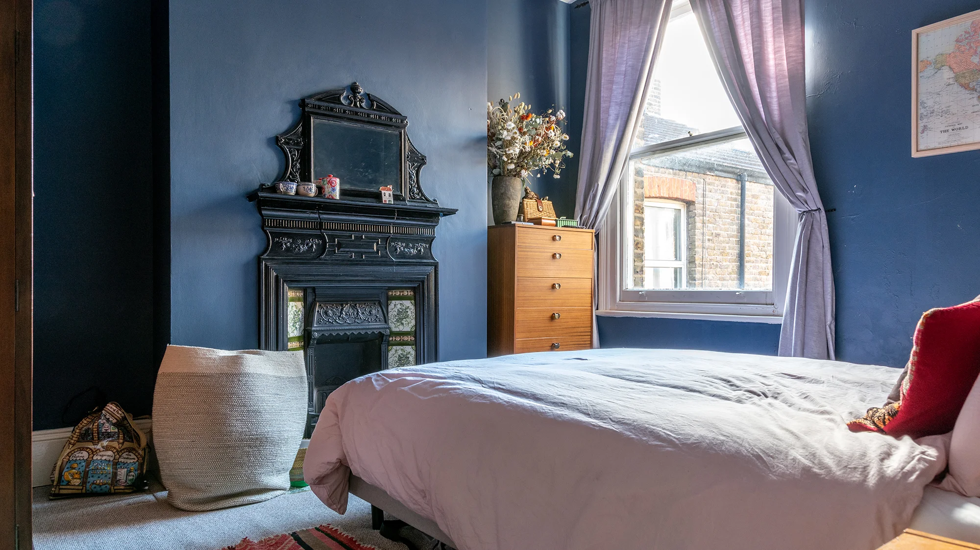
New Home - Bedroom Tour
I am really excited to share a little tour of my bedroom with you. Last week Vinterior came to visit my flat to take some photos and interview me about my interior style. I’m so pleased with how our bedroom has come together. I would describe our bedroom as Gothic Victorian meets mid century modern. It sounds like a total mess but in reality it feels charmingly eclectic in a boutique hotel kind of way.
Post sponsored by Vinterior
I am really excited to share a little tour of my bedroom with you. Last week Vinterior came to visit my flat to take some photos and interview me about my interior style. I’m so pleased with how our bedroom has come together. I would describe our bedroom as Gothic Victorian meets mid century modern. It sounds like a total mess but in reality it feels charmingly eclectic in a boutique hotel kind of way.
I had always liked the idea of having a navy wall behind the bed, and in the end we decided to just be brave and go for dark blue on all four walls. I’m so glad we made this decision and it gives the room such a dramatic yet cosy feel. I think the combination of high ceilings and the massive window means we get away with using such an intense colour. The colour is Breton Blue from Dulux. It was my husband’s idea to paint the radiator black to match the fireplace, and it works so well.
The thing with our bedroom is its biggest asset is also its biggest challenge; it has a beautiful original fireplace which somewhat limits the layout of the room. I love the fireplace, it’s so dramatic and unusual and it’s actually what originally drew me to the flat.
Obviously we wanted to celebrate the fireplace and making a focal point of the room, but that meant carefully buying furniture and that would squeeze into the remaining space. At first I wasn’t sure what kind of furniture I wanted, so I ordered a practical looking three door wardrobe from a high street retailer for just over £500. After the third time they failed to deliver it I thought to myself, what am I doing? It’s so expensive, it’s flat packed, it’s not even made of real wood and by the time we move house again it will probably look awful. So I had a look on Vinterior, and found my wardrobe of dreams which happened to be the same dimensions as the other wardrobe, but made out of solid walnut and £200 less. I immediately ordered it.
I found most of our other pieces of furniture on Vinterior as well. Initially I was a bit worried about how an antique wardrobe would you look in a room with a mid century chest of drawers and bedside tables, but I think the dark dramatic colour makes everything cohesive.
I love buying vintage furniture, you can find something unique that is well-made yet affordable, and it’s good for the environment. Vinterior made it so easy to find beautiful pieces in my price range and have them delivered to my flat. The nice thing is the pieces came from independent vintage and antique shops from all over the country, that I never would’ve found otherwise.
The finishing touches in the room are a pair of grey velvet curtains from DKNY, by at TK Maxx, a simple king size bed from made.com and a Peruvian rug next to the bed. The walls are decorated with framed Otomi embroidery we bought on our honeymoon, a vintage map and a giant gold hand painted fan I found in a vintage shop. I love the way it looks against the blue wall and how it catches the light in the afternoon. My friend Migle from Your London Florist gave me this enormous bunch of dried flowers and they still look amazing for months later. I love the how the colours look against the blue walls.
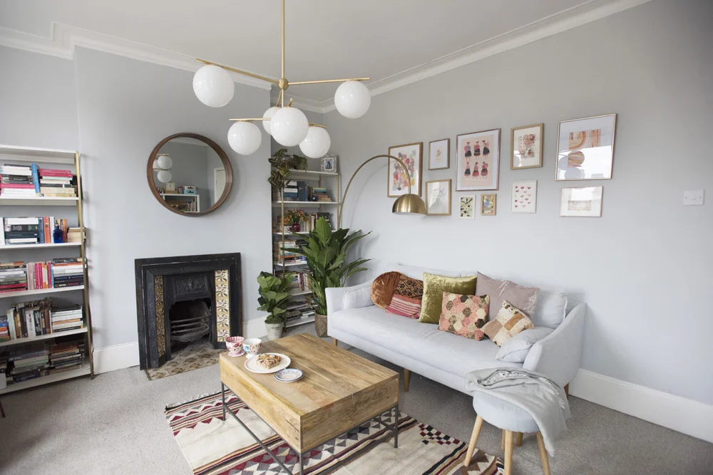
Our New Home - Living Room Tour
Earlier in the year my husband and I had to leave our rented flat of five years, but every cloud has a silver lining and for us that meant to buying our own home. I was so excited for us to finally have a place of our own, and really being able to put our own stamp on it.
Earlier in the year my husband and I had to leave our rented flat of five years, but every cloud has a silver lining and for us that meant buying our own home. I was so excited for us to finally have a place of our own, and really being able to put our own stamp on it. Our previous flat was furnished which meant we were starting from scratch, which was exciting and intimidating in equal measure.
I was incredibly lucky to work with West Elm on designing this room. I have been teaching at West Elm and have been admiring their beautiful furniture for years, so it was so exciting to finally have some of their beautiful pieces in my home. Moving from a rented new build flat into a large converted Victorian flat meant decorating options for this room seemed endless. Fortunately I had Sophia from the West Elm design team to help me plan the space and select pieces that would work with the few things we already owned (a free service West Elm provide). I showed Sophia the floor plan, a few inspiration images and talked about my personal style (obviously my husband lives here too but he let me have free reign with this room). We went for a slightly mid century modern look with lots of plants, sophisticated gold and brass accents and warm tones. I was initially worried that painting the walls the same shade of light grey as the sofa would be a bit of a mistake, but I think the accessories and soft furnishings really bring it together.
West Elm classes this sofa as a loveseat, but it easily seats three people and is incredibly comfy. I’m all about finding as much hidden storage as possible, which is why this coffee table is so perfect. Inside it is full of photo albums and boardgames. My husband and I are total bibliophiles so bookshelves were an absolute must. These shelves fit in so perfectly and hold a huge amount of books. My husband actually unpacked and styled the books, and I love the way he arranged them. I love the juxtaposition of my books next to his, copies of Jane Austen and Little Women, next to books about anarchy and moral philosophy. I like to think these bookshelves give you a bit of an insight into who we are as people. My husband and I don’t own a TV, which means we didn’t have to worry about pointing our furniture towards one corner of the room, and instead we can sit on the sofa and enjoy the lovely view of Victorian Almshouses through the bay window.
When I’ve tried to do a gallery wall in the past I’ve made the mistake of going too small and it has lacked impact, so I tried to be a little bit bolder with this one. The beautiful rose gold frames are from West Elm and the rest of the frames are either vintage or ones we already had from IKEA. I wanted the artwork on this wall to feel warm and peaceful, and I created a few abstract watercolour pieces especially to create this mood. I also ordered an A3 version of my Peruvian ladies print, and framed a piece of the original artwork from my book inspired by a trip to Morocco. I love how little reminders of our holidays together are scattered throughout the flat. The velvet cushions are from West Elm and the others are either from Peru or vintage patchwork, adding a bit of character to the sofa.
This room had a working fireplace but no fire surround. I sourced a Victorian tiled fire surround on Facebook marketplace for just £30. I absolutely love the tiles and I think it works so well within the room. As the fireplace is very decorative I kept it simple with this beautiful mirror above which nicely highlights the statement lighting. I absolutely love how they look in the room and they give out a gorgeous warm light. We placed them over the coffee table so no one walks into them and bangs their head, although my husband has hit his head on them at least once.
I love this cosy little corner. This chair is an antique piece that has been passed through the family; you can read about how I painted it green in this blog post. The combination of the pink velvet curtains, the green chair and the copper sidetable just makes me so happy. It’s the perfect place to sit with a cup of tea and ring my granny, as she’s the only person who ever rings my landline. The pink curtains are from DKNY, via TK Maxx and the cushion is from Peru.
This post is sponsored by West Elm, who kindly gifted me the furniture pictured in the post. The photos were taken by my very talented friend Tia Talula. The flowers and several of the plants were provided by my good friend Migle, owner of Your London Florist.
Joules x New Designers
Exploring the latest textile trends at New Designers in association with Joules.
Last week the team at Joules invited myself and my fellow blogging buddy Nancy to afternoon tea and a chance to explore New Designers. New Designers is one of the most important design events in the UK, offering design graduates a chance to showcase their work to the creative industries. For the first time Joules sponsored an award at New Designers; one lucky graduate won a cash price, a paid placement and a paid assignment to create a mural for their pop up store in Wells-next-the-Sea. Joules were looking for someone with a good understanding of colour and print, with eye catching, fresh designs that also have comerical apeal.
The winner was Chloe Hills, who studied Textile Design for Fashion & Interiors at Bath Spa University. Her winning piece was designed to create the feel of an overgrown jungle, with prints created large scale to maximise impact. I got in touch with her to ask her a few questions about what inspires her and how she created her final piece.
The theme of my hand painted wallpaper piece was Dark Florals & Foliage, giving it a slight twist by adding a pop of accent colour, to this very moody theme and creating over-sized imagery. What inspired my final wallpaper, 'Love-Lies Bleeding' was my collections of floral imagery that I gathered over the summer from RHS Hampton Court Flower Show, RHS Wisley Gardens, and from trips up and down the country visiting many gardens. I wanted to combine a contemporary feel with a very traditional theme using abstract shapes and a sophisticated colour palette.
I decided to hand paint this piece because I wanted to be more hands on with the design as a final piece and my aim throughout was to make an immediate visual impact which I felt the hand painted finish would do, as sometimes a design can get lost within a digital print for example. For me , It was also about getting the colours right which was something that I felt I had control over which was key. There is something unique too about it being hand painted, as it is it a one off piece. Plus it is exciting and I enjoyed doing it!
I am always on the look out for colour combinations. Colour inspires me greatly especially unusual and unexpected combinations when it comes to a new and exciting project the first thing I do it seek out on trend colour schemes. I like to revitalise a palette and think carefully about my proportions of colour. Inspiration comes from plants, gardens, natural sources, scenery and also architectural features from my surroundings.
What really surprised me about the exhibition was the high quality of work and the professional presentation. I was worried I was going to see the same old things again (I think we've all had enough of pineapples prints) I was really impressed by the fresh approach and unique ideas of the students. Here are a few of my favourite trends.
Monochrome Textures
You could see the influence of Scandinavian minimalism in some student's work, with the use of cool greys and interesting textures. These textiles are perfect for modern interiors. Jane Woolley creates beautifully tactile throws and cushions using natural fibres. Chloe Scott uses lino printing to create her cushions and textiles, and Isabel Cross brings her limited colour palette to life with touches of gold.
Jane Woolley
Chloe Scott
Isobel Cross
Painterly Detail
Painterly detail was a huge trend, whether it was loose water colours or detailed gouache paintings. Tana Pither's stunning work is painted with gouache and inspired by botanical illustration and old photos of the East African coast. She has had placements at House of Hackney and Timorous Beasties, and you can feel the influence of that in her work.
Tana Pither
Tana Pither
Natalie Percival creates beautiful textiles with her loose watercolours, inspired by the rugged scenery of Norway and the rolling hills of Surrey. Matthew Hodges work is simply delightful, inspired by the flora and fauna of British summer time and a love of colours.
Charlotte Atkins bought a fresh approach to tropical prints, with bold brushstrokes, a monochrome palette and sheer fabrics.
Charlotte Atkin - Matthew Hodges
Pastel Geometrics
Nadia Aggoun's work mixes the geometric with the botanicals in soft pastels shades. Her work reminds me of the patterns found in geometric tiles.
Nadia Aggoun
Quirky Details
Isla Rustrick and Lizzie Porter stood out for their quirky details and hand drawn approach to textile design. Isla Rustrick was inspired by OAP style icon Iris Apfel and her work involves screen printed illustrations and knitted details. Lizzie Porter's work also includes niave hand drawn details and embellishment.
Isla Rustrick - Lizzie Porter
The thing that really surprised was the lack of online presence these graduates had. Often the graduates didn't have a website at all, or they had a free website that was difficult to use. New Designers is such a wonderful platform, and it's a shame that the online presence of these graduates didn't match up to their incredible work. You don't need anything complicated, it's so important that the website is easy to use, easy to find, and people can contact you. If not you don't know what work you might be missing out on. You can read some of my top tips for graduates here.
This post was created in association with Joules, but all words and thoughts are my own.
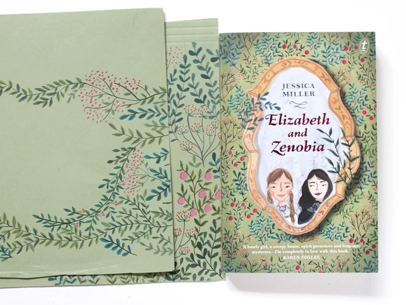
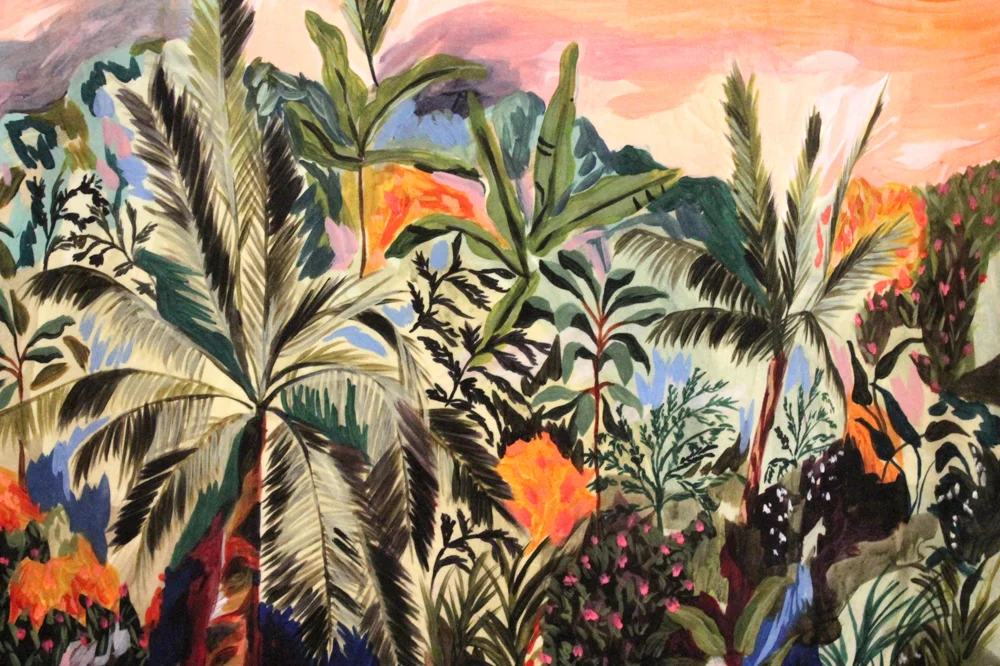
Illustrating a Book Cover
Last year Text Publishing got in touch with me about illustrating a book cover for an upcoming chapter book. It was a really lovely project so I thought I would share a behind-the-scenes peak with you guys.
They had a fairly clear idea of what they wanted from the cover so I went straight in with the sketch. The feedback was that the plant life needed to be more varied and more wild looking. After my second sketch got the go-ahead I started on the artwork. I painted the mirror and the girls separately and then layered them on photoshop so they could be edited and moved.
I painted the botanical wallpaper straight onto green paper which looked really lovely and definitely set the tone for the piece, but it was difficult to edit in photoshop. Ultimately I started the background again, painting individual plants on a white background which could then be removed in photoshop. The individual plant motifs could then be arranged on a green background which meant the design was much more flexible. The plant motifs were also use to create a gorgeous decorative title page. I also painted some little botanical flourishes to be used for the chapter headings.
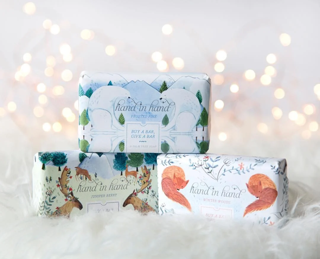
Hand in Hand Soap x Target
Hand in Hand Soap are one of my very first clients that I worked with when I graduated from university, and I’m really proud of the work we have done together. For a collaboration between Target and Hand in Hand soap we created a range of three winter inspired soaps.
Hand in Hand Soap are one of my very first clients that I worked with when I graduated from university, and I’m really proud of the work we have done together. For a collaboration between Target and Hand in Hand soap we created a range of three winter inspired soaps. I used a mixture of watercolour and cut paper to give the packaging a richly layered look, and we took our inspiration from nature. Which is your favourite? I think the polar bear is mine, I love how it has turned out.