
Illustrating a Greetings Card
This is a blog post all about digging in and trusting the process. Sometimes we hit the nail on the head first time, our first iteration of a design is perfect, it matches the idea we had in our head, and the client loves it. It’s great when that happens. But sometimes a design takes work, and it can take many revisions and iterations until the final piece matches the idea in your head, and really fulfil its true potential. Sometimes I feel like if I don’t get the design right first time then it’s no good, and that the more I edit and change and work in to a design the more overworked and contrived it’s becoming, but this piece reminds me that’s not always the case. We can trust the process and keep working into something and sometimes the end result can surprise us.
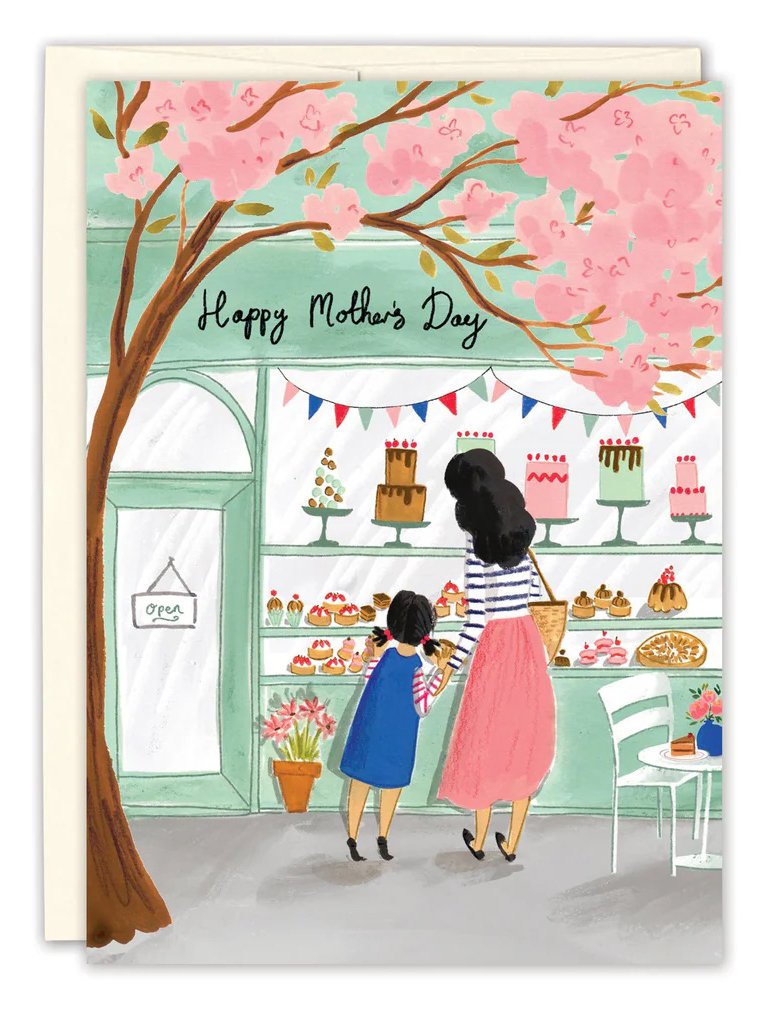
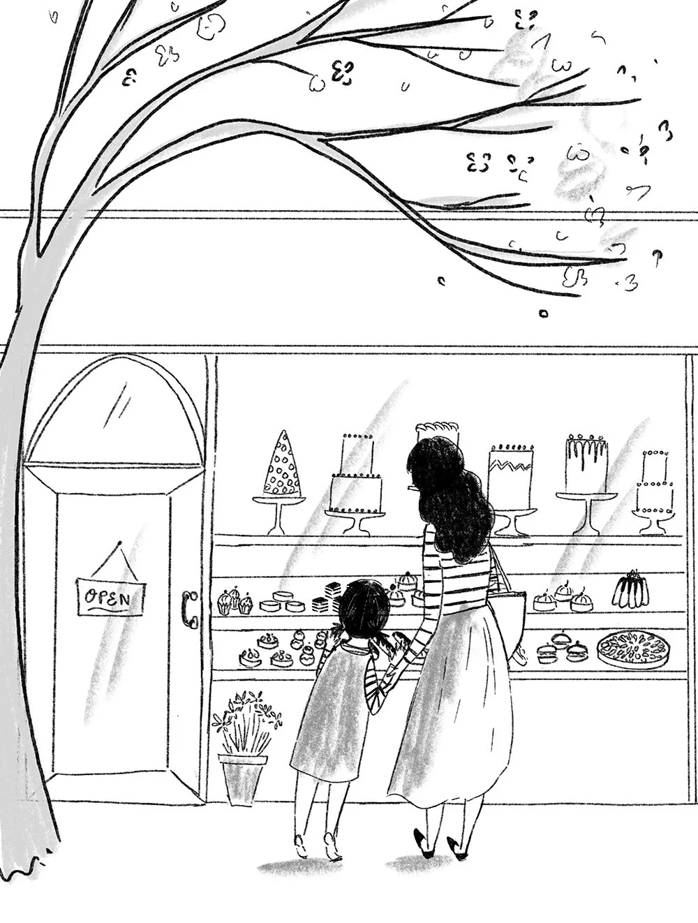
Biely and Shoaf asked me to come up with a Mother’s Day design, and I wanted to show a mother and daughter from behind looking through the window of a beautiful patisserie with spring blossoms framing the scene. My initial sketch got approved, but even at this stage, I felt like they were unresolved issues with the composition. Where should the ‘Happy Mother’s Day’ text go? Should be patisserie have a name? How close should we crop in on the mother and daughter?
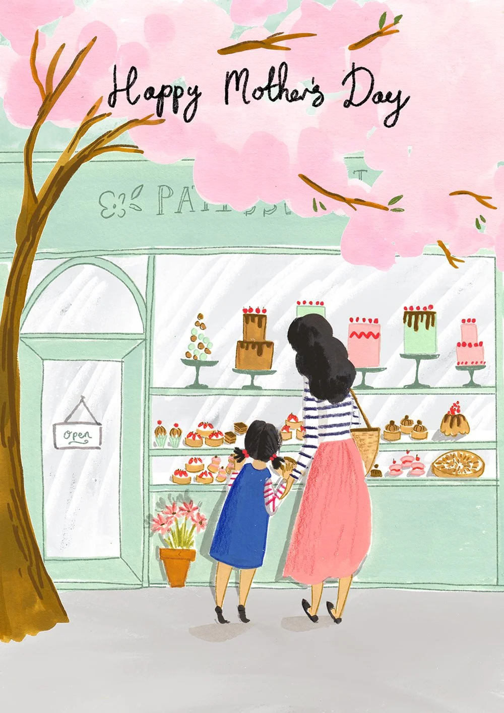
I painted my first version of the design and it just didn’t feel right. I’d gone for a cool pink for the blossom, and they were too flat and lacked detail. The whole design felt like it was just missing something. I talked to the lead designer Biely and Shoaf about it and she felt like it needed more details, so I added a table and chair with flowers and a cake and I added bunting to the window, which definitely helped add a sense of fun. I also made the text smaller, moved it off centre and cropped and tighter.
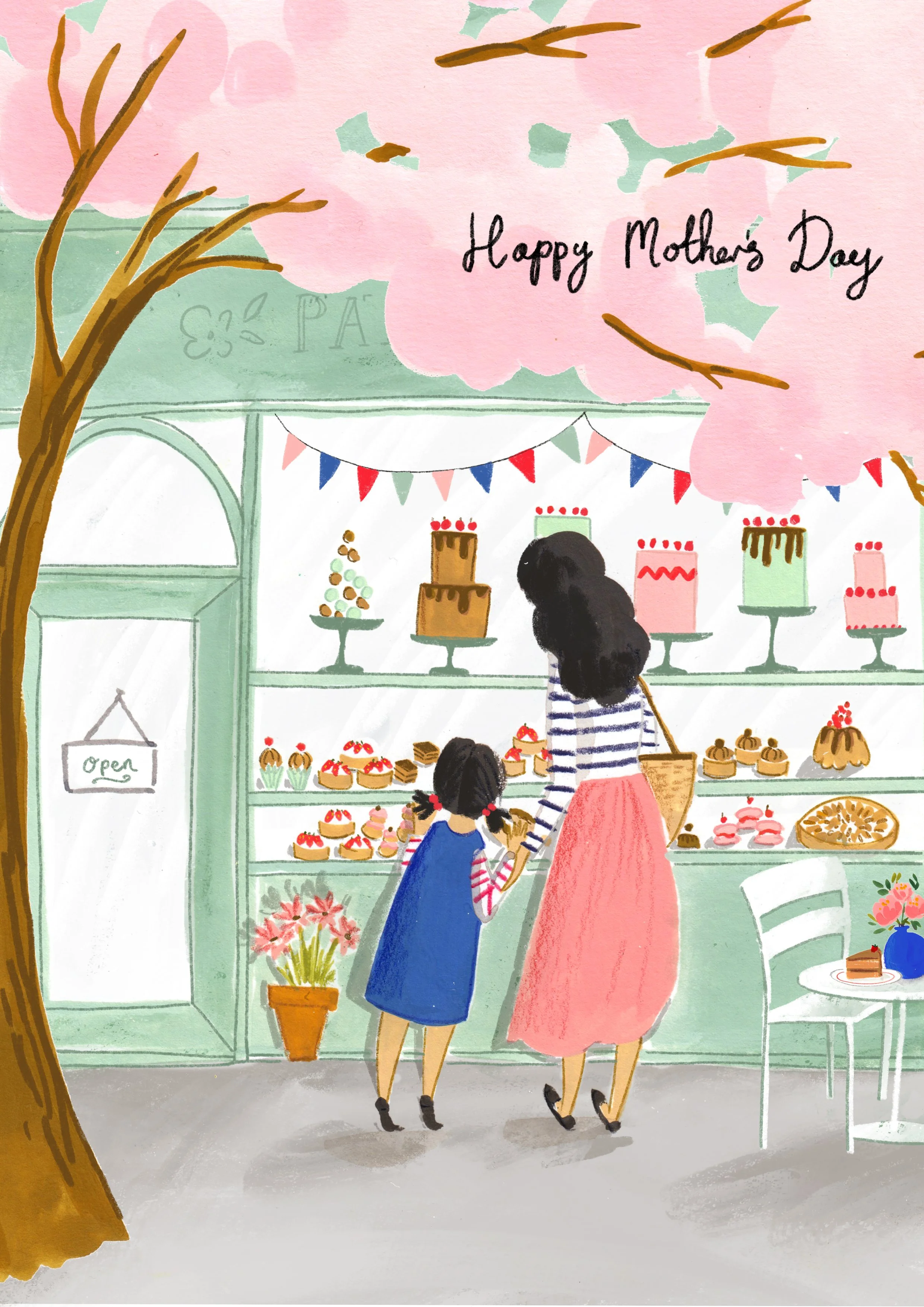
This version was better but I still wasn’t loving it 100%. The blossom still felt to blobby (technical term) and lacking in delicacy. I remembered a piece I did in my sketchbook recently where the blossom had more detail, was more broken up, and was a warmer tone, and was balanced out by leaves in a warmer tone as well. I repainted the tree using this technique and it pulled the whole piece together. I much preferred the warmer pink of the new blossom that tied in better with the other warm pink tones in the image. This new blossom left space for me to put the Mother’s Day text on the sign, and overall the design felt much more cohesive.
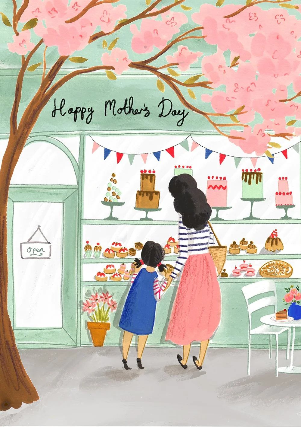
I’m really happy with how this card turned out, I’m really glad I didn’t just settle for my first attempt at it, which was fine, but wasn’t fulfilling it true potential. This piece also reminded me that warm colours are my happy place! As much as I might want to use bubblegum pinks, it’s warm tones that really shine in my work.